GRAPHICAL TECHNIQUES
The relationship between two variables in an experimental situation is frequently more apparent if the data is presented in graphical form. The steps in preparing an acceptable graph include:
1. Choose the "type" of graph paper to be used. (This will normally be rectangular coordinate paper but you may have an opportunity to use several other types of graph paper in the physics laboratory.)
2. Identify the independent variable (the one that is controlled or manipulated in the experiment) and the dependent variable (the one that changes in response to your changes in the controlled variable).
3. Lay out scales on the horizontal axis for the independent variable and on the vertical axis for the dependent variable. The "size" of scale used should normally be such that the graph will span most of the space available (usually the FULL PAGE).
Note: Each experiment that requires graphing will instruct you to construct a graph of A vs. B. In this notation, the first variable is plotted on the Y axis and the second variable on the X axis. This may violate the independent/dependent variable rules, but you should follow the instructions in the laboratory exercises.
4. Label each axis showing the scale, the quantity graphed, and the UNITS of measure.
5. Plot the individual data points; use a dot (.) or other symbol such that individual points will be readily apparent in the completed graph.
6. Complete the graph by drawing the SMOOTH CURVE that best represents the plotted data. Do not connect data points with straight lines. Do not force the curve to pass through any specific data points; specifically, do not force the curve to pass through the origin of the coordinate axes unless you have evidence that this is, in fact, a valid data point.
7. Title the graph. The title should be sufficiently complete so that the meaning of the graph is conveyed without additional comment.
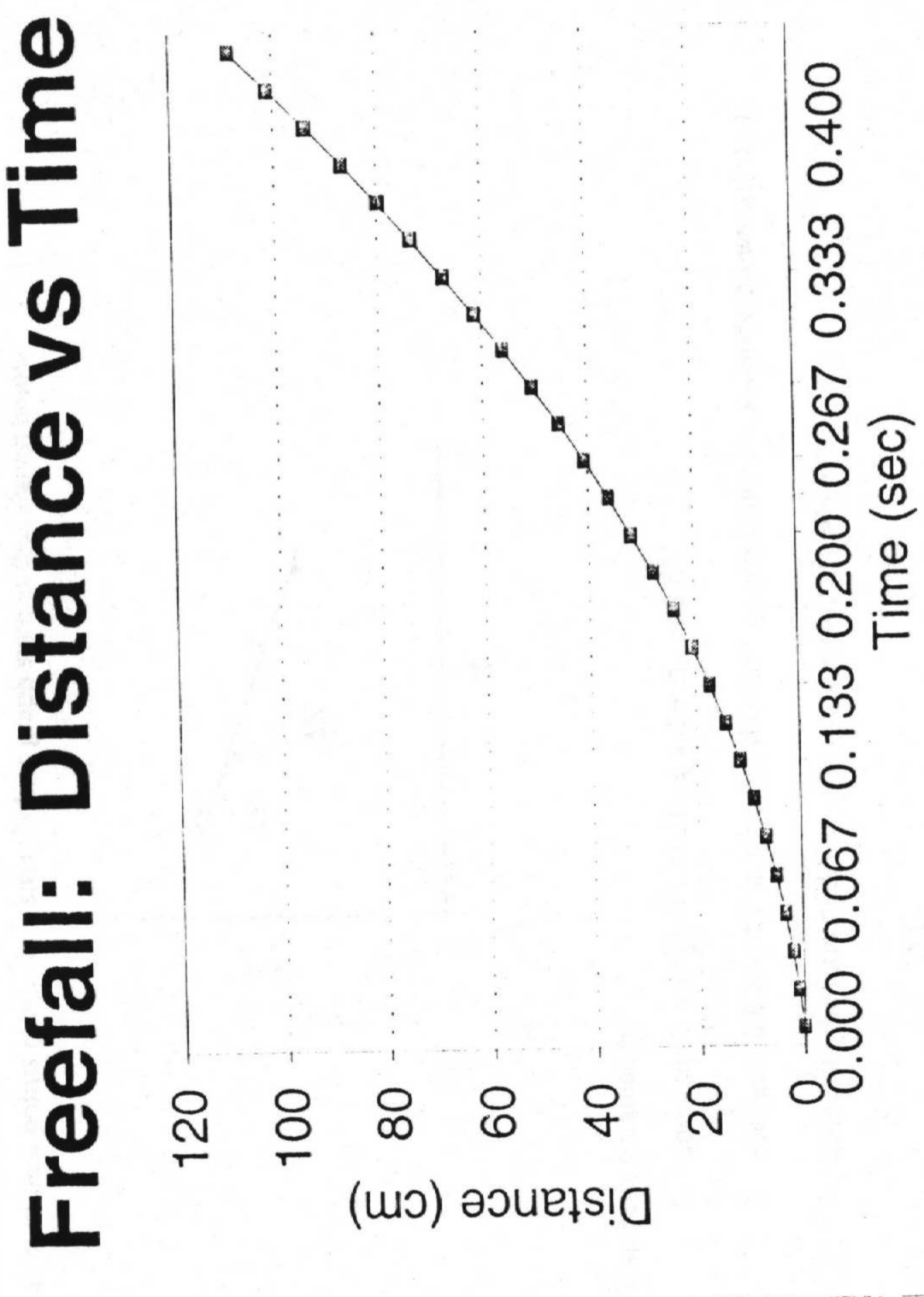
An example of an "acceptable" graph is shown on the next page.
Often data presented in graphical form yields a straight line. When this happens, we usually say that the dependent variable is directly proportional to the first power of the independent variable, or that y is directly proportional to x.
It is possible to characterize a straight line graph by its SLOPE. Often the slope corresponds to some physical quantity of importance to us, which is measurable as the rate of change of the dependent variable with respect to changes in the independent variable. Many important examples of this exist in physics. For example: the slope of the position - time curve for an object reveals the speed of the object; the slope of the momentum - time curve represents the force acting on the body; the slope of the potential energy - position curve is the negative of the force acting; the slope of the voltage versus current curve is the resistance of an Ohmic conductor; etc.
If a set of data points results in a straight line graph such as that shown below:
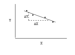
the slope is obtained by:
![]()